

Out of over 400 products we selected 25 of our most iconic, interesting and succesful projects. Take a trip into the history of FLEX!
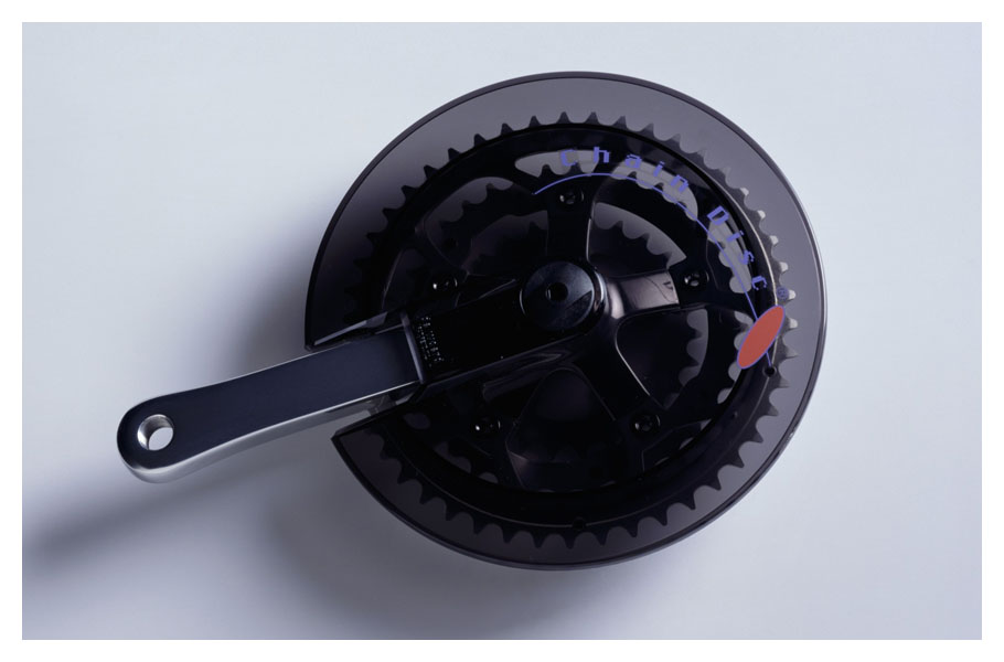
Chaindisk / De Woerd (NL)
Once upon a time there were only traditional Dutch bicycles with chain guards consisting of many different components. When mountain bikes and ATB bikes emerged without any chain protection De Woerd was losing its role in the industry as a manufacturer of bike accessories. Our solution to the issue was a very effective idea: a disc protecting people against the greasy chain but still look cool on their sporty bike. Even though there are hundreds of different types of bikes the Chaindisc has a 100% universal connection method. Many years the Chaindisc was sold in unrivaled numbers with high margins.
Awards: GIO
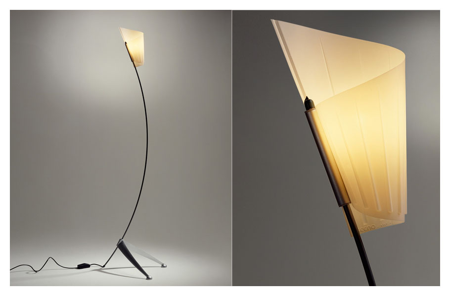
Floor, table and wall mounted light fixtures / Segno (IT)
Very few things are as mesmerizing as staring into a fire. The light fixture range ‘Alibi’ takes man-made light back to where it came from: fire! A limited edition was manufactured with a silk stocking above the light and a small ventilator underneath blowing up the stocking. It created a light effect that strongly resembled the liveliness of fire. The larger quantities of fixtures were produced without the fire-feature but the poetic image of a torch remains. For many years ‘Alibi’ was part of the Segno collection between the work of Allessandro Mendini, Matheo Thun and other design leaders of that time.
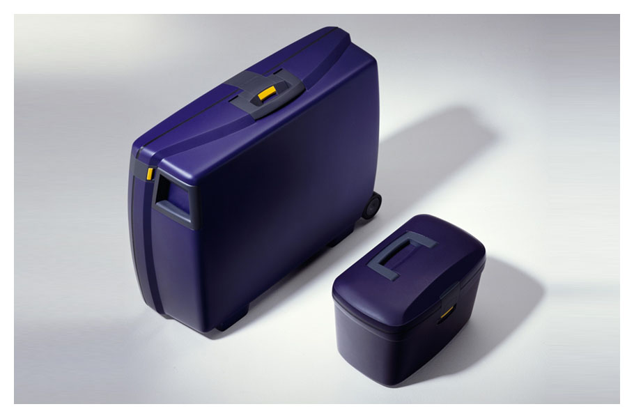
Suitcase range/ Sociale Werkvoorziening Presikhaaf (NL / BE)
Our consumer insight was that most of the time suitcase are not used and create obstacles in the storage areas at home. We came up with the idea for a range of travel gear with a large suitcase, a medium sized suitcase and a beauty case, that all fit within one another like Russian dolls. This unique functional feature was combined with a form factor that made the range very recognizable in retail. It gave Presikhaaf the opportunity to manufacture the range for Samsonite‘s private label and sell it through this brand’s wide distribution network. The Presikhaaf suitcases have been the travelling companion for many people and can still be seen on airports around the globe.
Awards: winner Gelderse Vormgevingsprijs
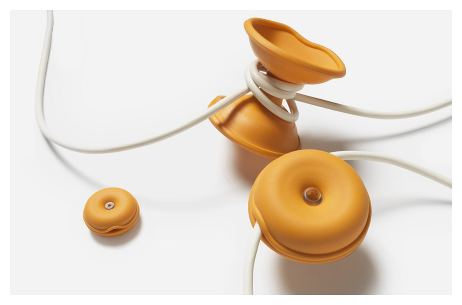
Cableturtle / Cleverline / Sociale Werkvoorziening Rotterdam (NL)
In a time with the market for computers and electronic devices exploding cables became a daily nuisance, at home at work and on the road. Our idea for a small rubber shell that could be opened to roll up any excess cable became a worldwide best seller and a true nineties design icon. There are 3 sizes available: the giant for long cables, the original for shorter cables and the mini for headphones. Its huge popularity worldwide made us realize that the meaning of a product can reach beyond its functionality. The CableTurtle gives people with a handicap and limited opportunities a relevant and productive role in our society.
Awards: iF best of 10 / RedDot / GIO / CLIO best of show
The Cableturtle is part of the permanent collection of MoMA in New York
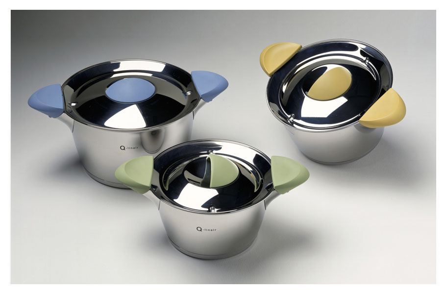
Qlinair cooking products / Koninklijke van Kempen & Begeer (NL)
The Q-linair range marks our work in kitchen products. Every product in the range is a combination of user centered design and carefully crafted aesthetics. The lid of every pan locks underneath the handles for straining. The steamer fits in the pan for added cooking possibilities and the cutting board locks onto the top of the big pan. The series has moved BK as a brand into a new era of modern kitchen ware and won a position in many international retail channels.
Awards: iF
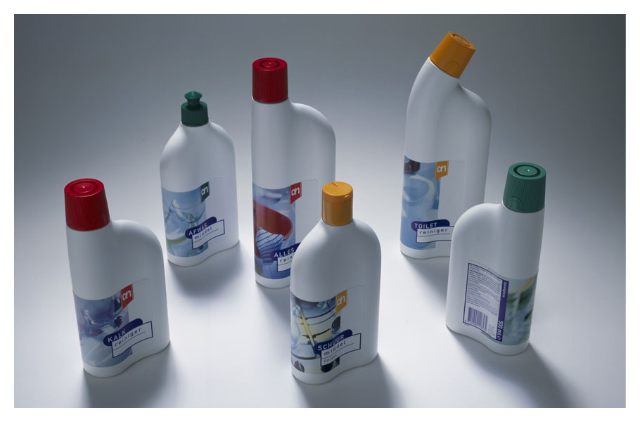
Packaging for liquid cleaners / Albert Heijn (NL)
Together with Millford Brand ID (2D packaging) a beautiful range of bottles was created for the liquid cleaners of Albert Heijn. It was combining beauty with clever solutions for logistics, manufacturing and ergonomics. The bottles were in production for more than 8 years, establishing Albert Heijn private label as a market leader in ‘non food’ categories and making us aware that integrated 2d and 3D design can really make the difference. It is a milestone marking our role in structural packaging design and the creation of 3D brand languages.
Awards: iF best of Category, ID Annual Design Review, GIO, ‘zilveren noot’, ADCN Silver lamp, Clio best of category
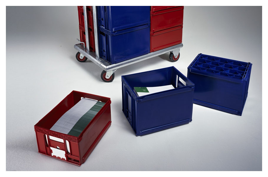
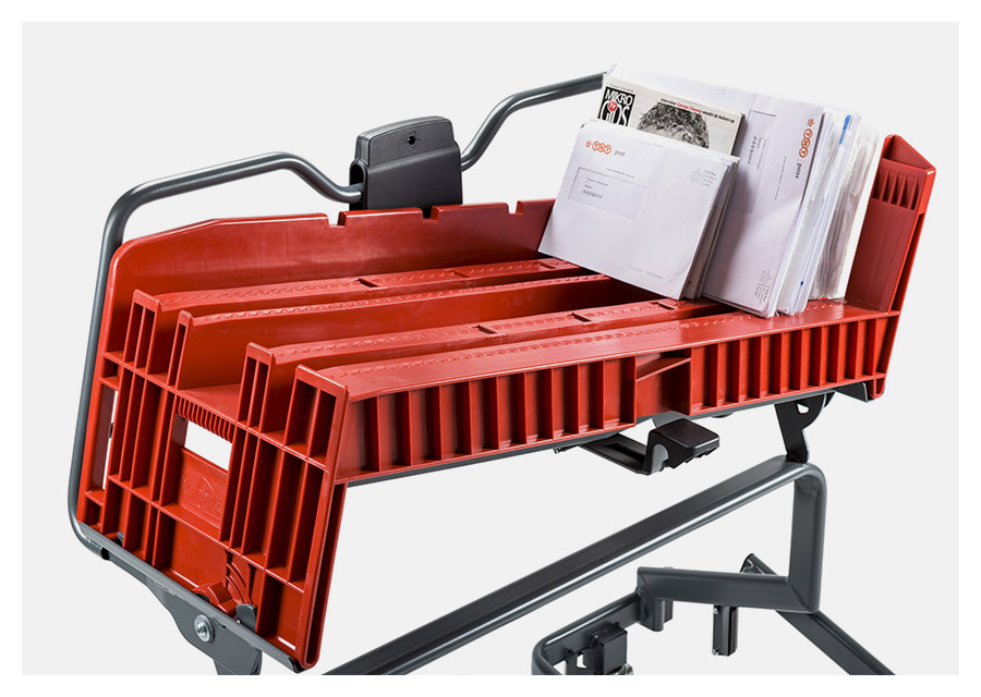
Post 2000 logistic aids for mail sorting / PostNL (NL)
The Royal Dutch Mail (currently PostNL) had the objective to make the process of sorting and delivering mail less labor intensive. In a joint effort with the experts of PostNL, sorting equipment suppliers, injection molders and trolley builders we developed the red and blue trays as well as the tray cart. A unique locking system connects the trays to the cart so even on a bumpy road the mail will stay neatly in place. We made sure that this crucial logistic aid works with all the sorting equipment and the different transportation means. Up until today this system is used in every stage of the logistic chain and has enabled PostNL to stay competitive.
Awards: GIO
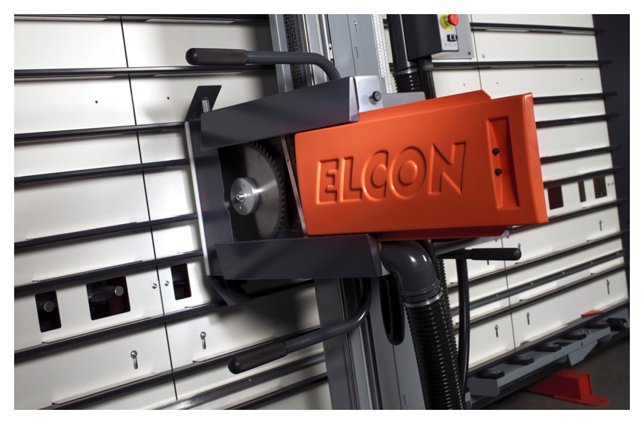
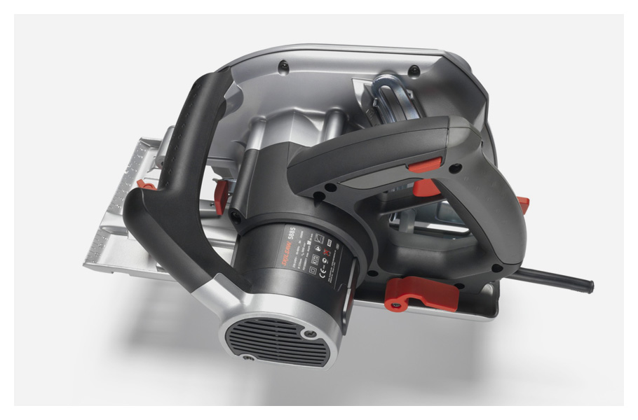
Vertical Panel Saw / Elcon (NL)
For many years we have worked on the range of professional Vertical Panel Saws manufactured by Elcon. In close collaboration with their great team we have improved the product step by step. First the actual saw unit got a make-over resulting in a stronger brand identity and better ergonomics. Later on a modular frame set up led to leaner production logistics, more compact shipment and higher precision. Altogether this helped Elcon to increase international sales and become category leader when it comes to innovation. If you ever had your plywood cut to size at the local DIY store there is a good chance that it was cut with an Elcon saw designed by us.
Awards: GIO
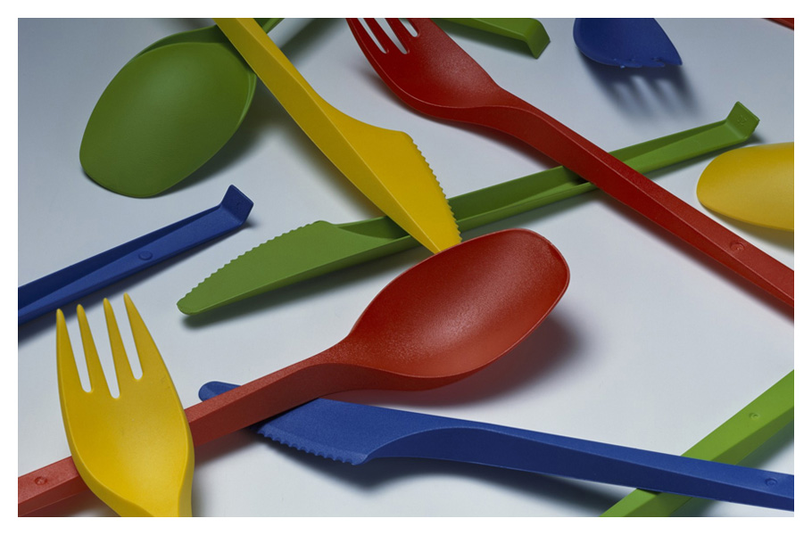
Disposable Cutlery / Haval Disposables (NL)
Disposable cutlery is injection molded in huge quantities, packed in big-bags and 1 m3 boxes, stored in large ware houses and shipped in trucks. We questioned why robots take the products in an organised way out of the 48-cavity tool and then create chaos by throwing them into a big box? Our light weight alternative is the first-in-the-world nestable cutlery and let the robot stack them neatly in 48 stacks. This volume reduction saves 78% in packaging, warehousing space and shipping volume! People tell us they look and feel good as well. Up until today around 200 million a year are sold!
Awards: GIO
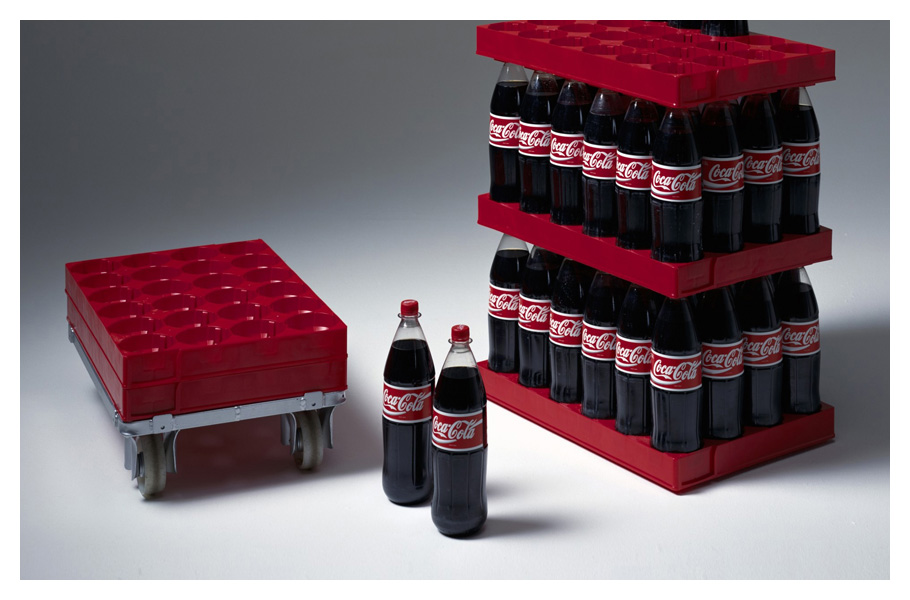
CocaCola Tray / Wavin Trepak – Albert Heijn – CocaCola (NL)
Coca Cola bottles used to be shipped in crates on pallets, order picked and shipped on a second pallet, placed on shelf by hand and stocked in the back of the retailer. Our solution was to create a stack of bottles on a dolly right after bottling without the need for anyone to touch them until a customer puts one in his shopping cart. A wonderfully simple idea that has been made a reality through clever engineering by FLEX’ and Wavin’s engineers. Today the trays are not only used for CocaCola but also all high volume Vrumona drinks saving millions in handling cost each year.
Awards: GIO special award
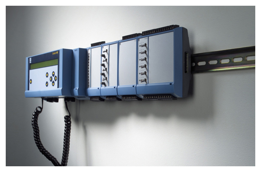
Modular Control Unit / Priva (NL)
Buildings have varying needs when it comes to control of heating, cooling, ventilation or lighting. To make real estate ‘future proof’ it must be able to adapt quickly to the increase in spaces to control or the need for more functionality. Our system takes a truly modular approach. With only 8 injection molding tools we could make more than 40 functionally different units. Whenever the needs change, modules can be added or removed to create the functionality required. A universal rail is used as a backbone for mounting the system and a smart plug connects the modules electronically.
Awards: GIO
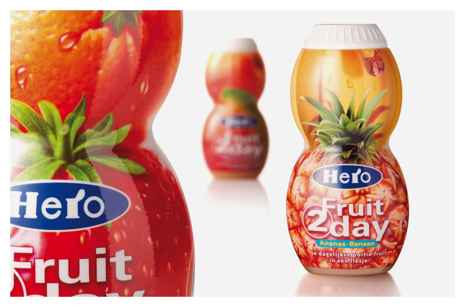
Fruit2day / Hero (CH)
‘What can we do with this chewy drink’ was the question Hero asked us. Our answer was the proposition of something that equals eating 2 pieces of fruit every day: Fruit2day. Together with Millford Brand ID we gave it the look and feel that was crucial for its success. With enormous success in Europe and later the introduction in the US it became one of the jewels of the Hero drinks division. The bottle is still in production in its original form. Its success has meant that every day about 2 million pieces of healthy fruit are eaten around the world.
Awards: Red Dot, nomination Dutch Design Award
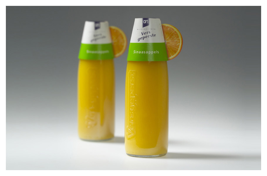
Fresh juice packaging / Albert Heijn (NL)
The Albert Heijn juices taste great because they are squeezed from fresh fruit every day again without any type of artificial conservation. The only thing we had to do was to make this clear to everyone who saw the bottle. Our notion that packaging has 3 moments of truth: catching the attention, convincing to buy and offering a great experience during consumption revolutionized the category. This iconic bottle on the breakfast table equals a carafe of freshly squeezed oranges and left the competition far behind for many years.
Awards: Red Dot, winner Dutch Design Award
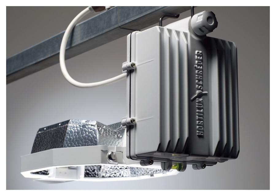
Greenhouse lighting / Hortilux Schreder (NL)
Greenhouse lighting is meant to add light to crops during nighttime in order to increase production. We realized that during the day the fixtures have very little function, in fact they take away sunlight as a result of the shadows they cast on crops. Therefore we focused the development of the fixtures on making them as compact as possible. We separated the bulky components from the light itself eliminating the majority of the shadows. In later years we continued our work for Hortilux with even more compact products that increased production results. Today we are developing advanced LED solutions but the original notion is still the key benefit of the product.
Awards: RedDot
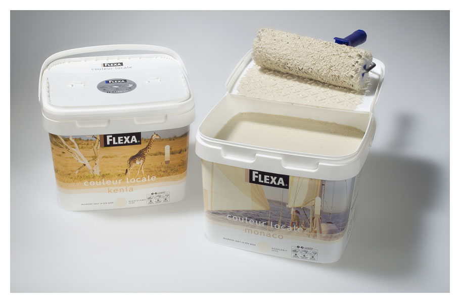
Paint packaging / Akzo Nobel (NL)
Nobody likes the hassle of pouring paint in trays, spilling paint or cleaning trays afterwards. When one of us was painting a wall at home he realized how he could improve this with a hinge section in the lid of the paint container. You just have to open the lid, snap it in position and roll on the inside of the lid. Without additional cost consumers get a great deal of convenience and in return they save water for cleaning trays, they save plastics and they don’t spill chemical waste into our sewage system. AKZO Nobel gets an increase in market share! It has that ‘I wish I’d thought of that’ according to the jury of the ID Annual design review.
Awards: Best of category ID Annual Design Review, winner ‘Gouden Noot’, IDSA Gold award, winner Dutch Design Award
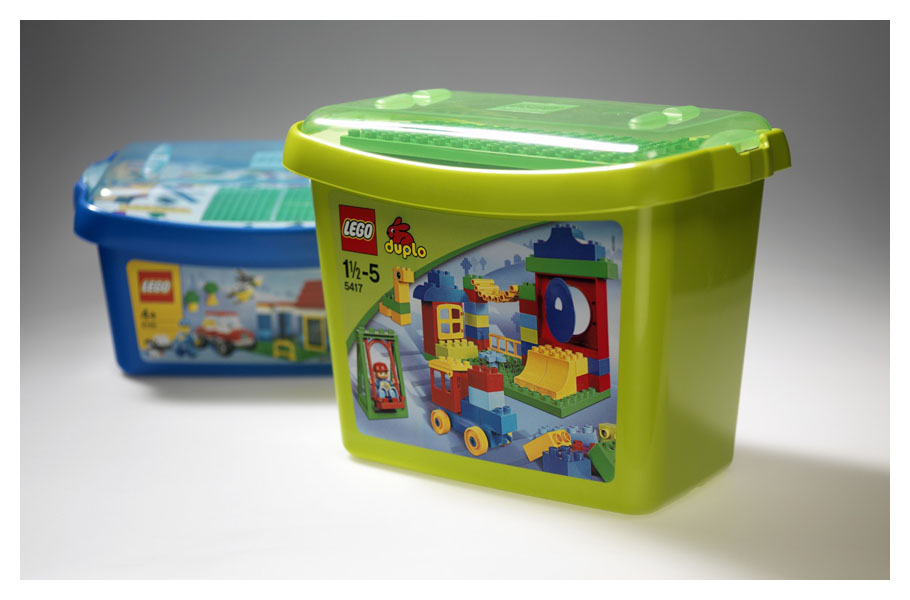
Storage boxes for starter kits / LEGO & DUPLO
LEGO offers more playing possibilities than any other brick building brand around. Our job was to communicate this through the storage boxes for the starter sets. Making the lid transparent was technically difficult but payed off in the end because the sneak preview on the special elements like the play-starters or the building plates really make the difference. Of course all the practical things like storage and durability are important but they can’t beat the emotional side of a product like this. The subtle curve of the box offers a friendly smile to anyone who wants to see it and the smile is always returned when children open up their gift. It confirms our believe that also for brands like LEGO we can connect the dots!
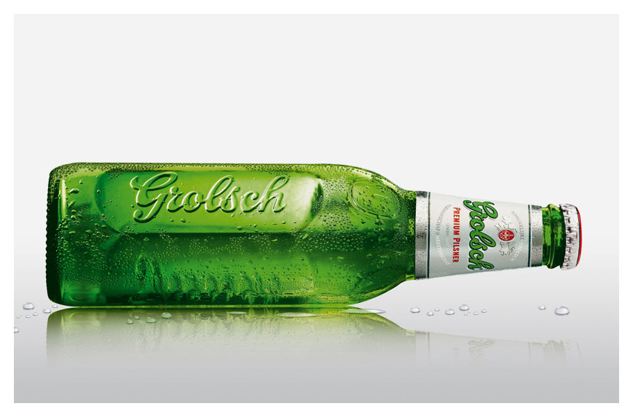
330ml bottle, Swing top bottle, glasses, POS products / GROLSCH, SAB Miller
Everybody knew the traditional brown Grolsch swingtop bottle. Very few people however drink from swingtop bottles because they are big and heavy and because they are to honest… a little old fashioned. We took up the challenge to create a Grolsch design language that translates the values incorporated in the swingtop to all other brand touchpoints of Grolsch in a contemporary style. The 330 cl bottles, the glasses, the Grolsch beer fount, the point of sale materials but also the original swingtop bottle itself were redesigned to make it modern and ownable. It has given Grolsch a new sense of pride and is now available in many parts of the world. Many competitive brands today are copying what Grolsch dared to do almost 10 years ago!
Awards: ID Annual design review, ADCN nomination
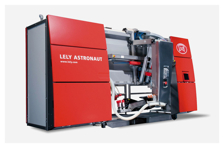
Astronaut automated milking system / Lely
In 1996 Jeroen Verbrugge graduated as Industrial Designer at the TU Delft with the development of a milking robot. It was a radical innovation in dairy farming. The cow’s welfare as well as the farmer’s is improved while production increases. Lely is now market leader in this category where Jeroen pioneered. Our design proposal for the Astronaut milking robot took this barn product to the next level. From a prototype look and feel it became a product, making the Lely Astronaut unique in the market. It was even featured on a series of Dutch stamps honoring breakthrough innovations. This project proved the value of design to Lely and is the basis of our strong relationship from which many products and eventually the Red Rules resulted.
Awards: GIO
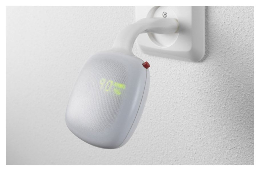
Wattcher / Innovaders, Eneco
For many years Innovaders walked around with the idea of a product that would stimulate people to reduce their energy consumption. We helped Innovaders to realize the product and asked Marcel Wanders to design the look and feel. It is one of the first ‘connected products’ nudging people to preferable behavior by making them aware of what they do. The Wattcher shows your energy consumption at any given moment in the form of rational value and through an emotional heartbeat. Bottom line people save about 10% on their energy consumption and that is exactly what we were trying to achieve.
Innovaders gave a TED talk about their quest to change consumer behaviour.
Skil power tools and garden tool / Skil, Bosch
Skil products offer DIY enthusiasts the tools to make their efforts successful. We create the design that makes the difference through considering every user aspect of the tools. Better control over the quality of work through improved ergonomics of the handles, clarity in functionality by well-designed and laid out controls or helpful features that make storage easier.
The visual design language we developed throughout the range helps to establish a consistent brand look and feel but also differentiates two different levels of quality.
Awards: Red Dot
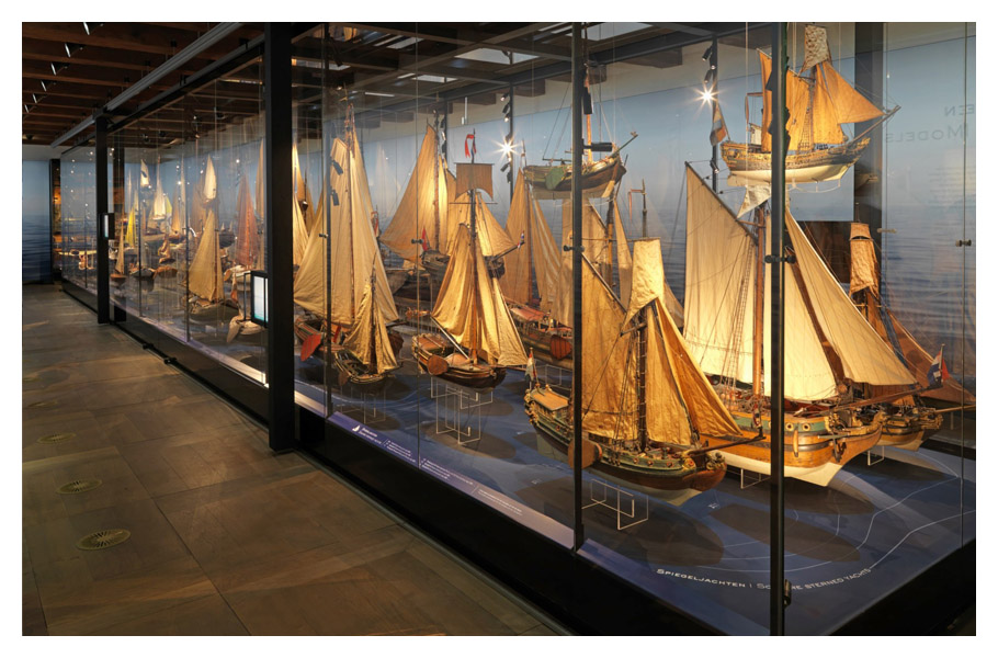
Museum displays and courtyard accoustic floor / Maritime Museum Amsterdam
The old ship models and maritime objects need careful conservation. Therefore the atmosphere in which they are displayed must be modified to the right temperature, oxygen level and humidity. Instead of modifying the entire atmosphere in the museum we developed displays in which the air can be fully controlled; an elegant solution that lets the visitor experience our maritime heritage to the fullest.
Additionally an acoustic floor was developed for the impressive courtyard of the museum. It minimizes the sound reflection and making it an enjoyable space. The museum welcomes about 80.000 visitors every year.
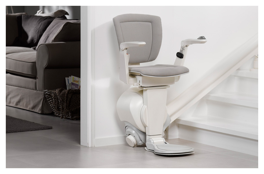
Stairlift / Otolift
Ever since 1993 we have worked extensively on the stairlifts manufactured by Otolift. Their products definitely deserve a place in our ‘hall of fame’. There is a beautiful technical complexity about them that makes us very proud. We supported the transformation of Otolift products from mechanical equipment into desirable interior products. This transformation provided the basis for continuous national and international growth for Otolift. Otolift products positively make a difference and touch more and more people’s lives! Over the years we have been responsible for a wide range of innovations with the development of the single rail stair lift as the flagship for the Otolift brand.
Awards: Red Dot, GIO
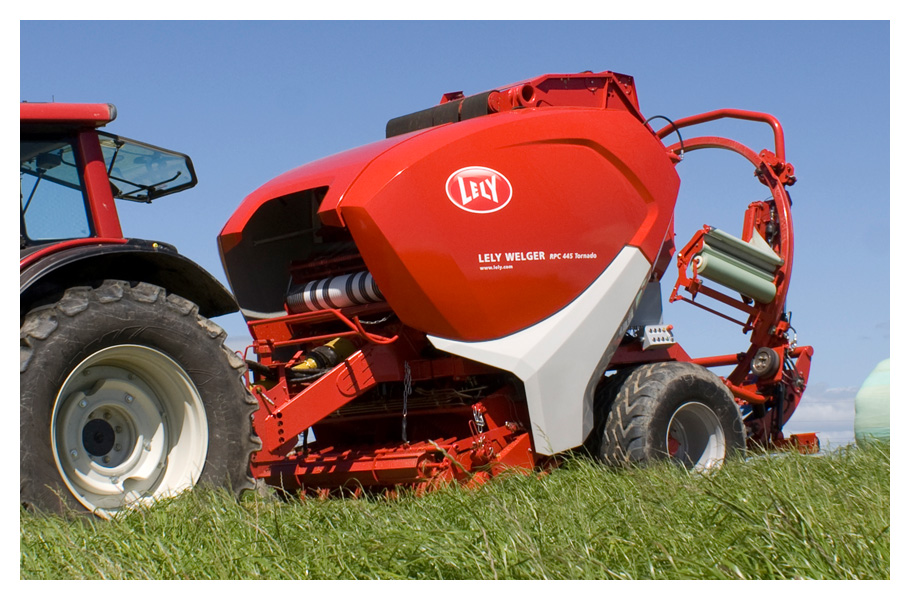
Baler / Lely
To support Lely in its ambitions for the future and to visually tie together their expanding portfolio of agricultural equipment we have developed their Product Brand Language, the Red Rules. The Lely baler was the first product designed based on the Red Rules. The Red Rules help in expressing the Lely brand values creating a family of products but also identify unique product features.
For the baler we have used powerful lines and a bold signature element, the scoop in the side cover, to express power and productivity. The Baler almost wants to eat the crops. The Lely baler family is unique in its appearance and a success in the market. Red now Rules the crop fields of the world.
Awards: Red Dot, GIO, winner Dutch Design Award
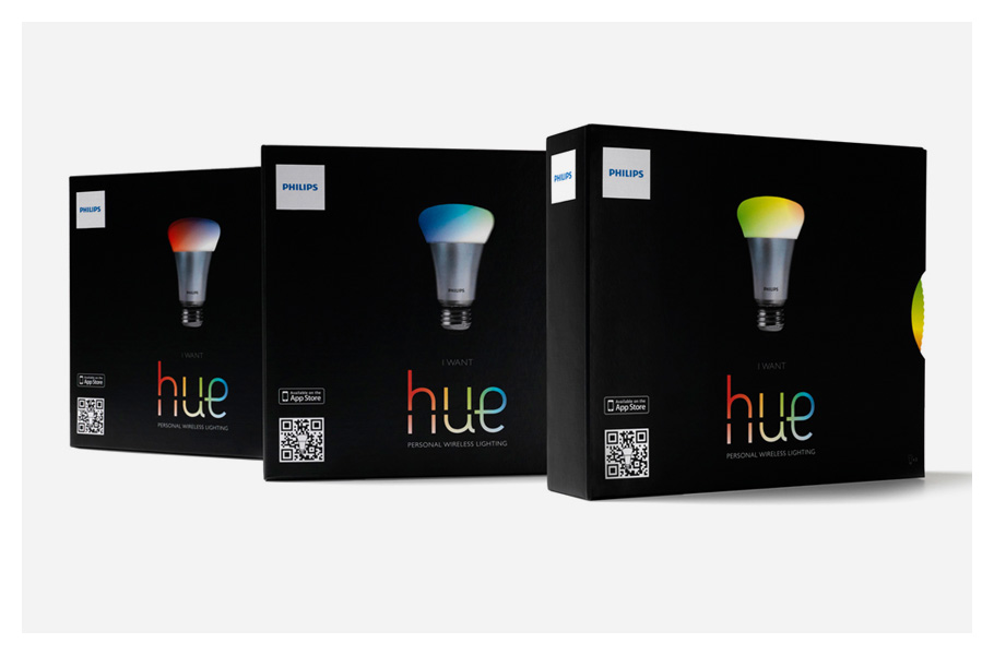
Interactive packaging – Philips / Hue
Besides the product design we also are involved in the structural packaging design for Philips products. Hue is the LED lighting system by Philips that connects your light to the internet. To communicate its interactive qualities we developed interactive packaging! For instance in the Apple stores people are invited to turn the disk and change the color of the light on the front of the pack while it is in shelf. On the inside the disk offers clear instructions concerning the installation procedure. A wonderful creative solution that has amazed people around the world and helped to make HUE as successful as it has become.
Awards: Dieline award, Pentaward, GIO special award
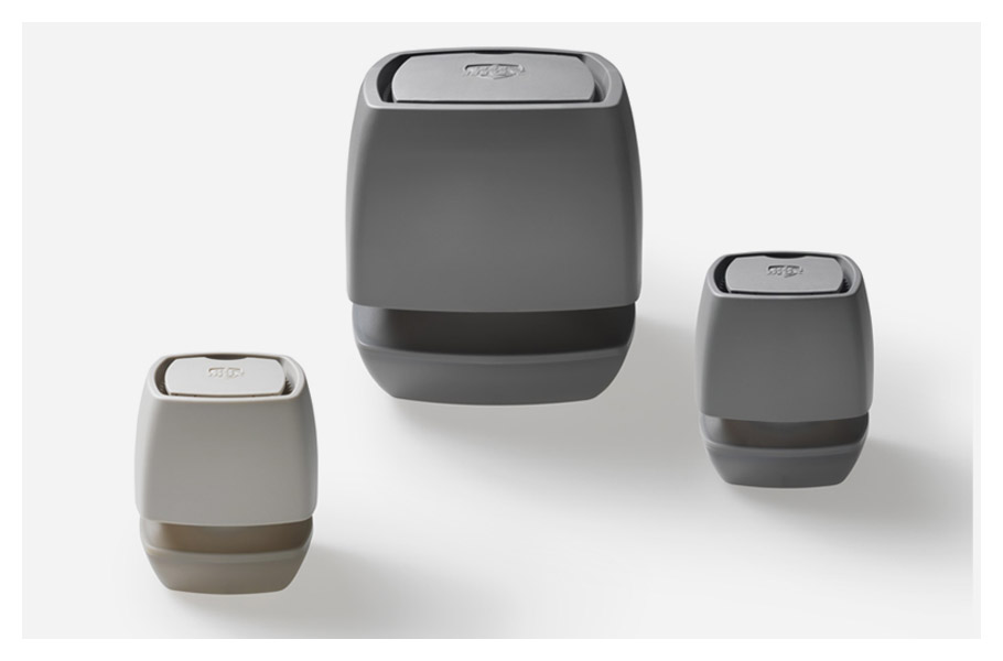
Moisture absorber Home Dry / Bison
Turning physics into profit! We aimed at creating a product for Bison that would out-perform the competition and at the same time delight consumers with a new look and feel. The venturi working-principle was the basis for our new moisture absorber. It helped to establish a better air-flow through and superior absorption properties. It was also the stepping stone to a geometry that offers new design opportunities. We managed to turn a product only used in basements and dark cellars, into something that fits well in any interior space. People must recognize the new application possibilities because sales volumes have reached all-time highs.
Awards: RedDot, GIO special award, Design Accountability Award
ISM Mail Processing Aid / PostNL
Since the development of the tray cart and the red and blue trays in 1996 we have worked for PostNL on many innovations that improved their internal processes. The ISM project is a perfect showcase how we as designers can manage complexity through our specific way of thinking and our ability to make solutions tangible. We have played a crucial role in the co-creation process with PostNL, with sorting equipment supplier Solystic and the manufacturer in China. We have designed and engineered the ISM as the interface between the new superfast sorting machines and the operators who have to work comfortably in this complex context.
Awards: winner Dutch Design Award, GIO award
Elektronicaweg 22
2628 XG, Delft
The Netherlands