Smart solutions for a sustainable future

Our work
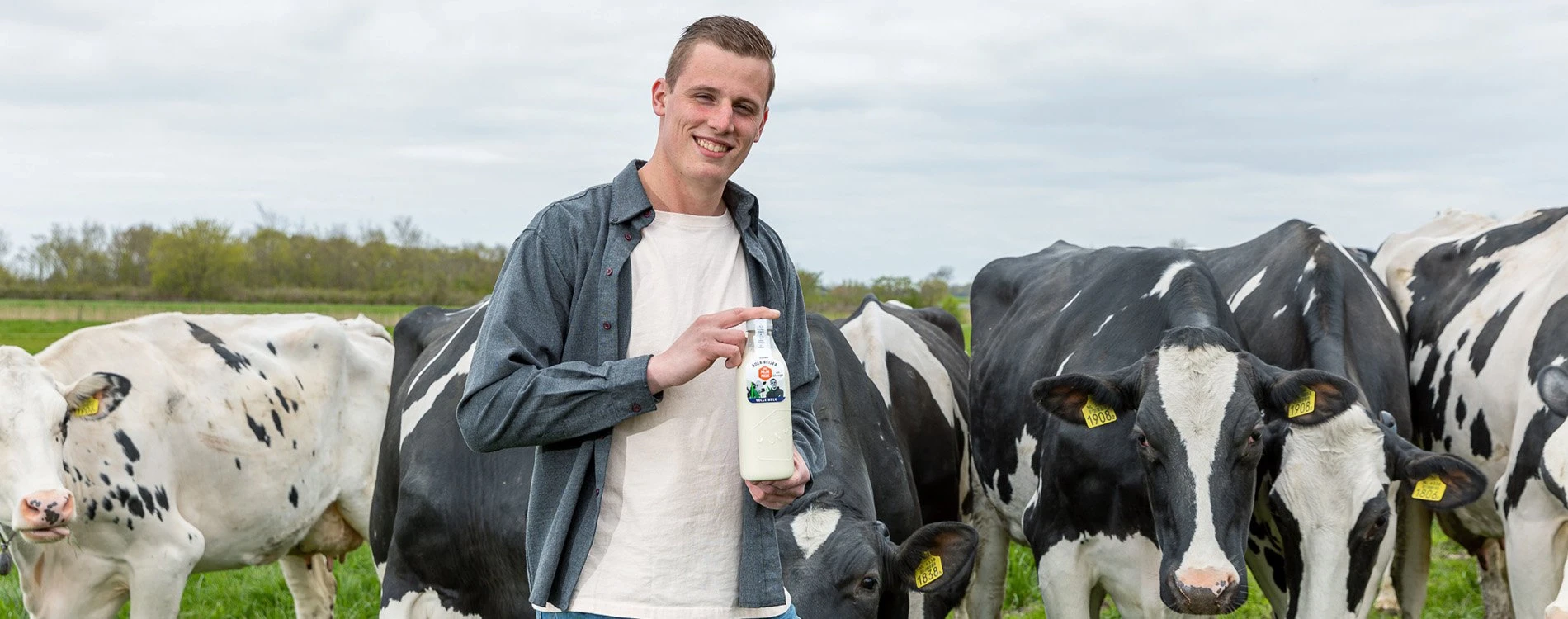
Mijn Melk
Lely
Mijn Melk
Lely
Mijn Melk
Lely
Empowering farmers to market local milk
Mijn Melk
Lely
Empowering farmers to market local milk
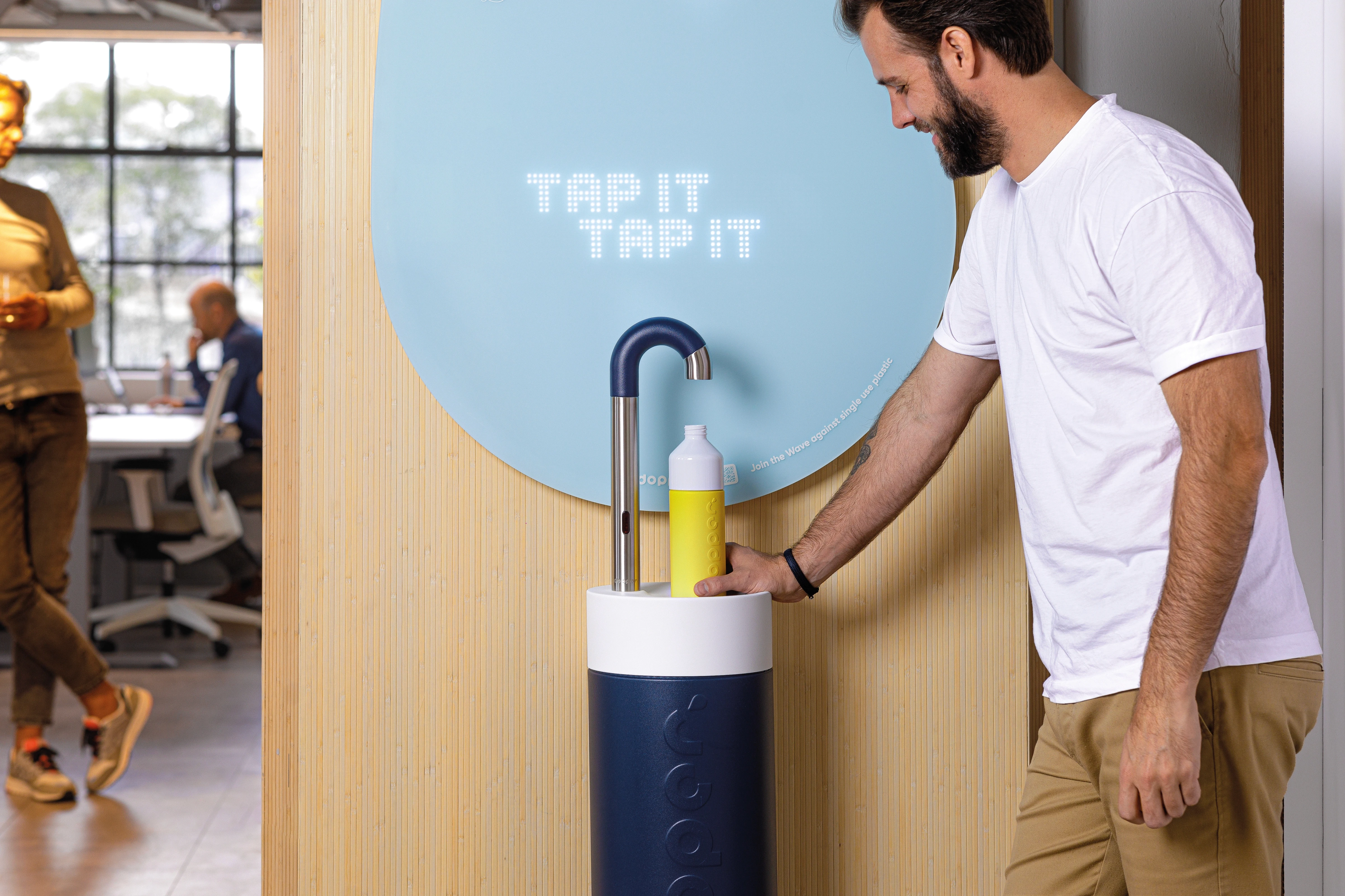
The Talking Tap
Dopper
The Talking Tap
Dopper
The Talking Tap
Dopper
The water tap designed to change behaviour
The Talking Tap
Dopper
The water tap designed to change behaviour
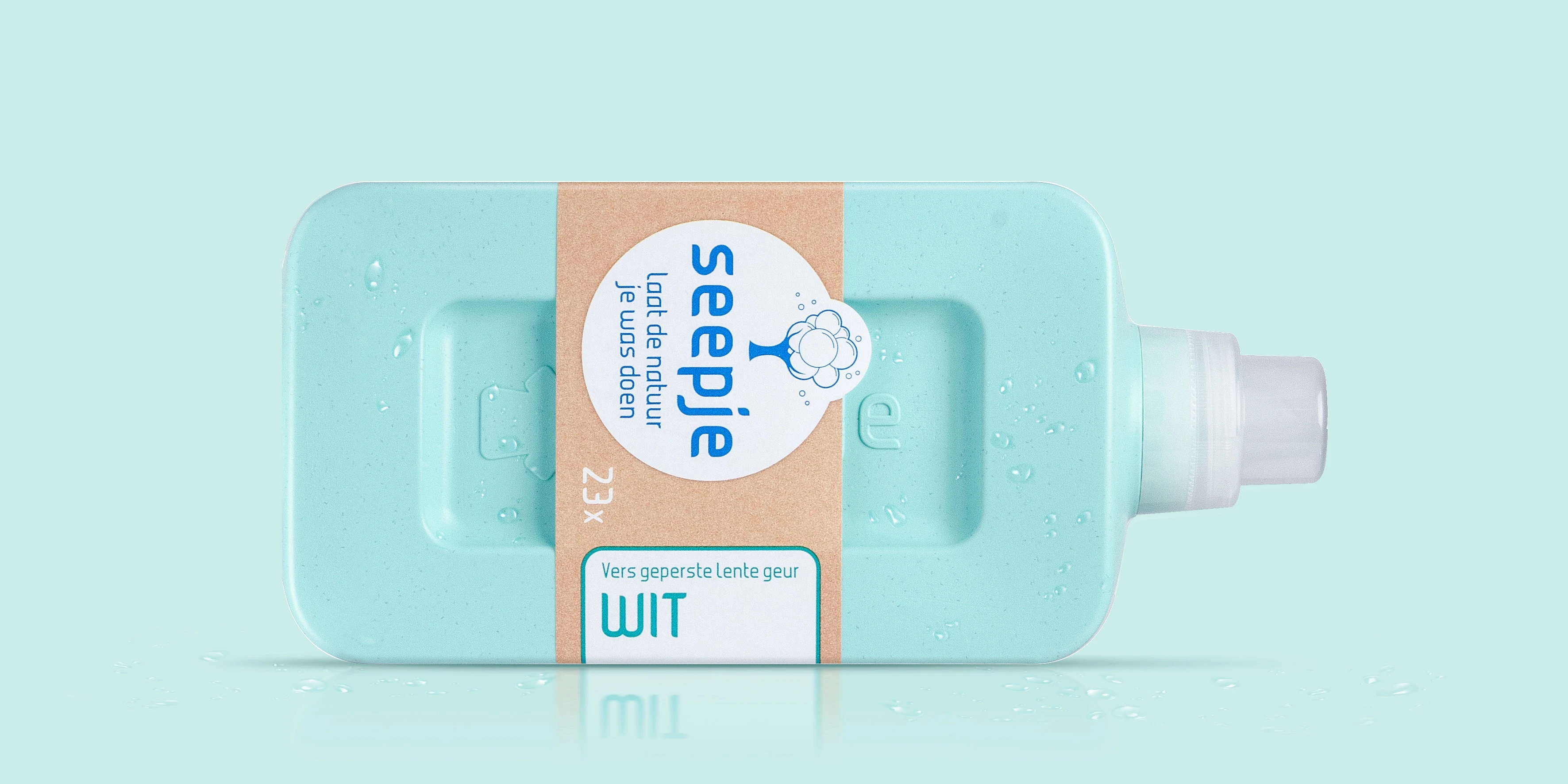
Sustainable Soap Packaging
Seepje
Sustainable Soap Packaging
Seepje
Sustainable Soap Packaging
Seepje
Telling the story of sustainable soap
Sustainable Soap Packaging
Seepje
Telling the story of sustainable soap
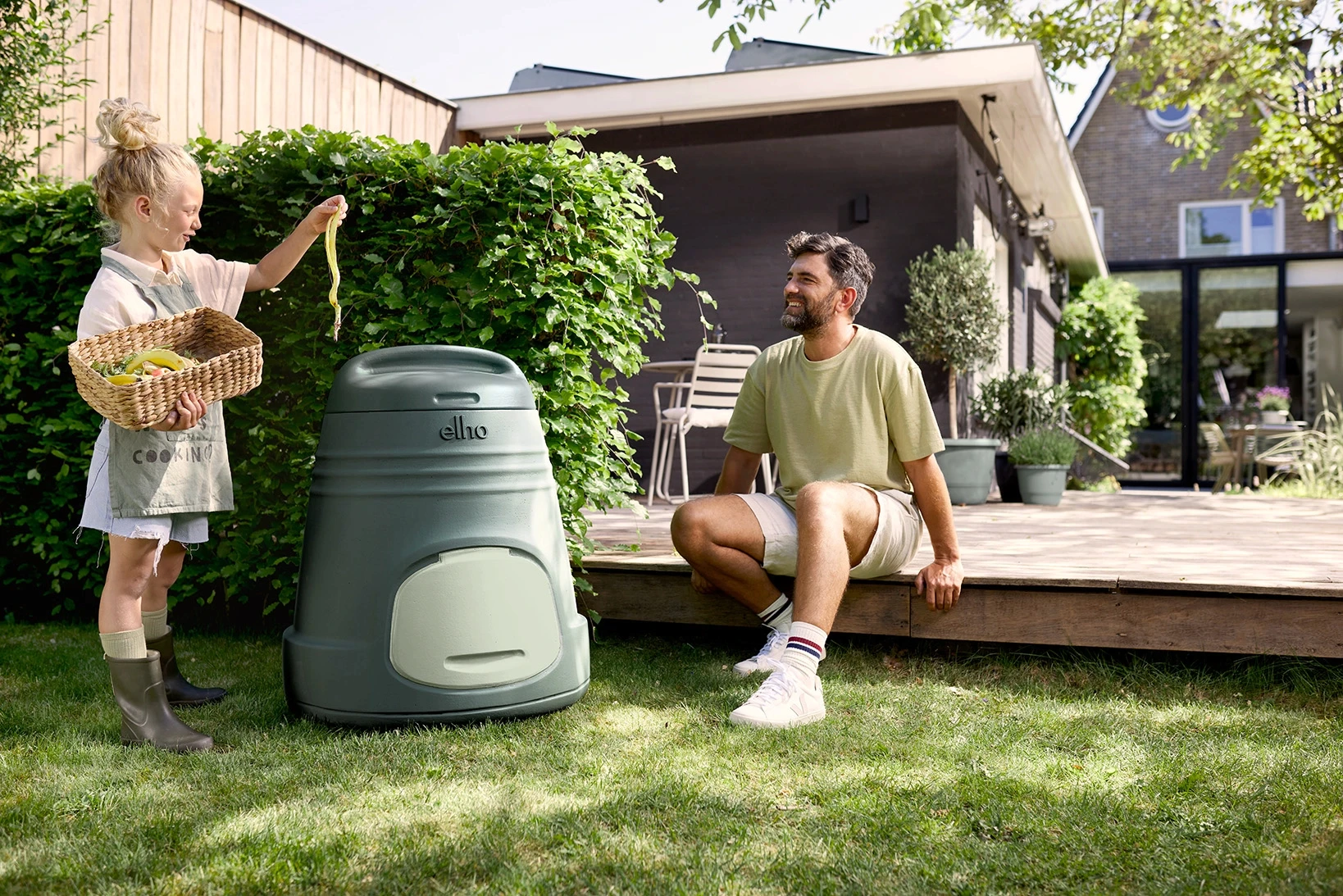
200L Home Composter
elho
200L Home Composter
elho
200L Home Composter
elho
Inspiring consumers to connect to nature
200L Home Composter
elho
Inspiring consumers to connect to nature
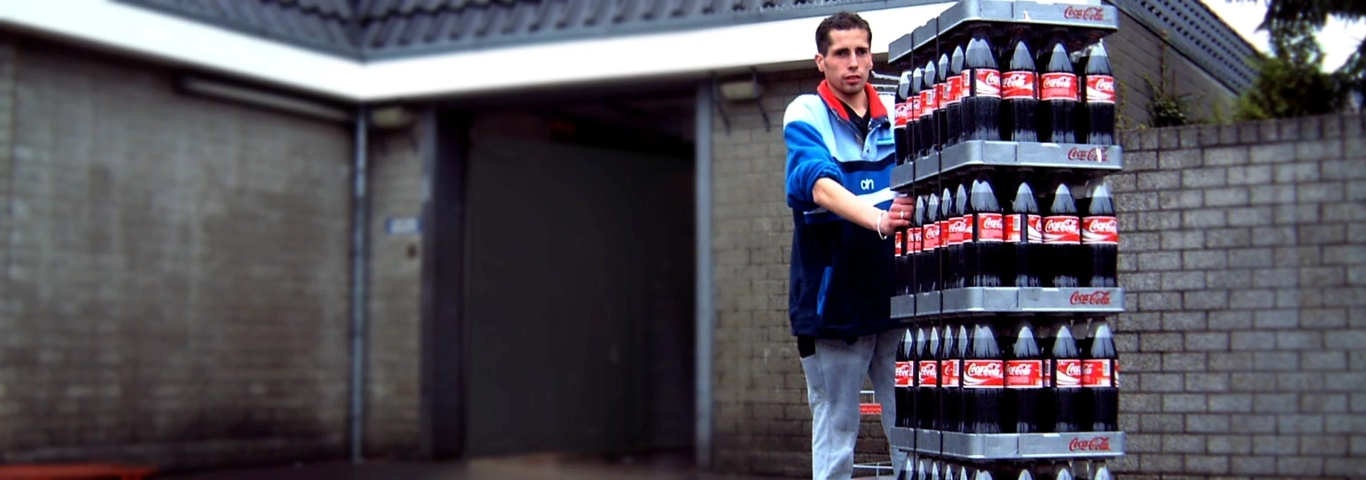
Returnable Soft Drink Tray
Albert Heijn + Coca-Cola
Returnable Soft Drink Tray
Albert Heijn + Coca-Cola
Returnable Soft Drink Tray
Albert Heijn + Coca-Cola
Effortless handling saving time, cost and resources
Returnable Soft Drink Tray
Albert Heijn + Coca-Cola
Effortless handling saving time, cost and resources
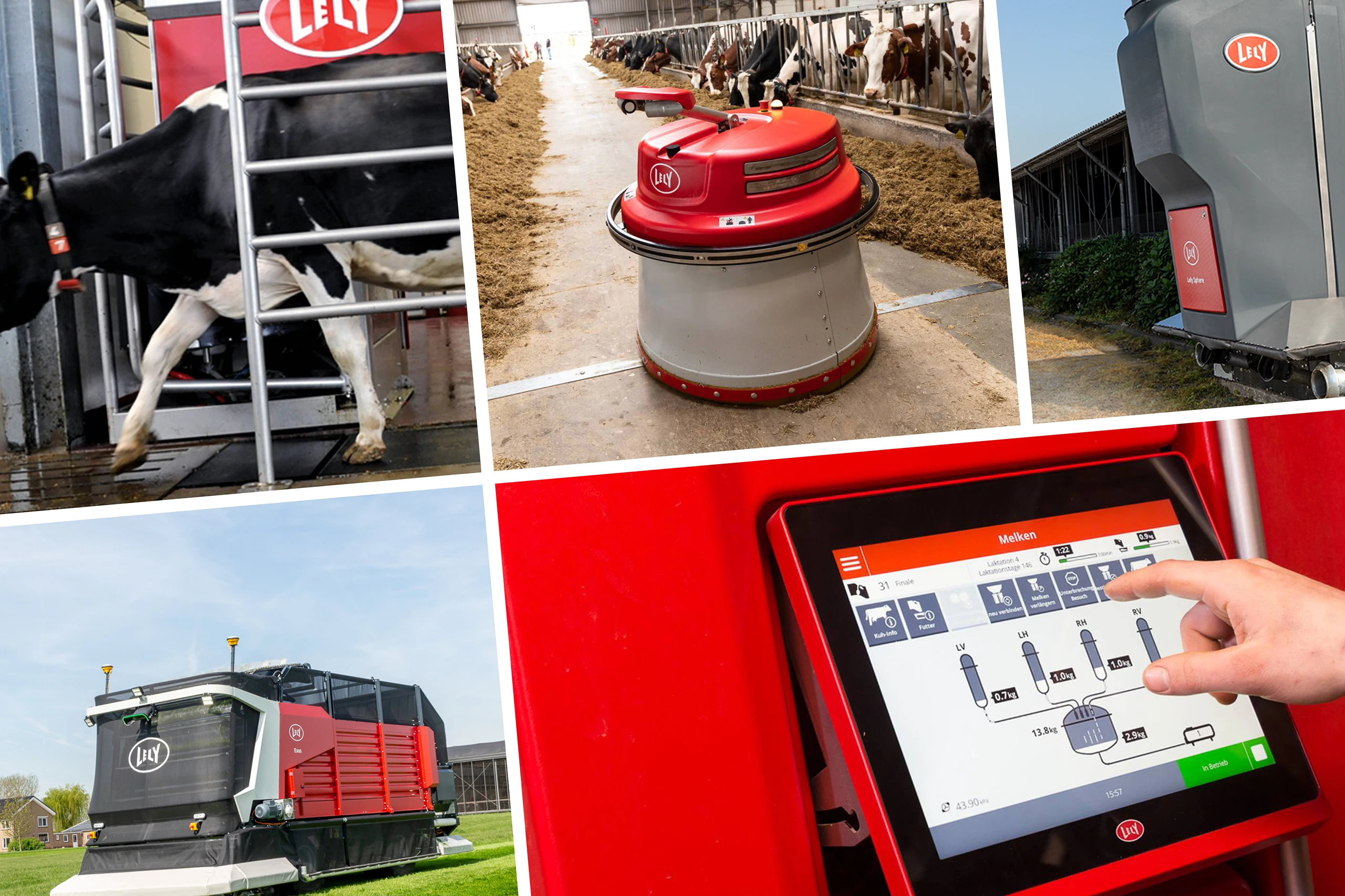
Red Rules
Lely
Red Rules
Lely
Red Rules
Lely
Design guidelines for the smart farm
Red Rules
Lely
Design guidelines for the smart farm
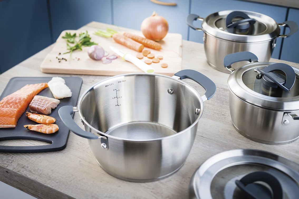
Tefal Clever Cookware
Groupe SEB
Tefal Clever Cookware
Groupe SEB
Tefal Clever Cookware
Groupe SEB
User-friendly solutions for healthy cooking
Tefal Clever Cookware
Groupe SEB
User-friendly solutions for healthy cooking
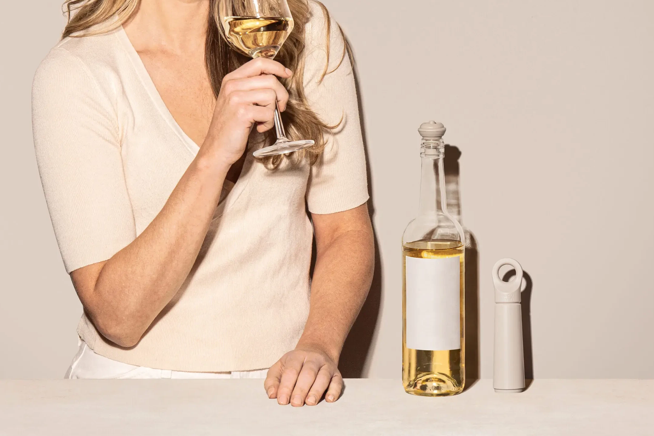
Loop Winesaver
Vacu Vin
Loop Winesaver
Vacu Vin
Loop Winesaver
Vacu Vin
Repositioning Vacu Vin: let the next gen enjoy every drop
Loop Winesaver
Vacu Vin